About Photographer
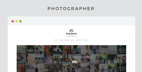
Photographer is a responsive html template created for creative Photographers with a minimalist design and optimized for mobile.

Features
- Minimalistic & Distraction Free Design
- Optimal Image Viewing Experience On Any Device with zoomable images
- Live Photowall Homepage
- Responsive Design & Retina ready
- HTML5, CSS3, jQuery powered
- Flexible Images & Videos
- 2 blog layouts (with or without sidebar versions)
- Complete blog system (all post formats supported)
- Responsive video embed in various aspect ratios (youtube/vimeo …)
- 30+ social media icons
- Custom Widgets (Flickr, Instagram, Pinterest, Dribbble, Picasa, YouTube)
- Ajax contact form with validation
- Extensive Documentation & Support Forums

Updates
v1.2 – 15 January 2016
- added one-by-one loading option to galleries (boosts loading speed on huge galleries) (see "Documentation > Html > Galleries > Load Gallery Images One By One" section for details)
v1.1 – 11 December 2015
- added new page : home landing image- added new page : home landing slides- updated : photoswipe script- updated : fluidbox to prevent images grow more than 100%- fixed : contact page fun-fact column drop issue- removed media-wrap class (not needed anymore)- fixed smooth loading on home landing page- improved full width images- recommended image size for photowall changed : old: 150x150 - new: 220x220 (px)
v1.0.1 – 13 July 2015
- fixed a syntax error in main.css file- fixed contact-form not sending issue
v1.0 – 30 April 2015
- first release
Credits
- jQuery
- Bootstrap
- PhotoSwipe
- OwlCarousel2
- Animated Responsive Image Grid
- CollagePlus
- Fluidbox
- Slippry
- Subtle Hover Effects
- Navicon Transformicons
- Social-Photo-Stream-jQuery-Plugin
- Uniform
- Google Fonts
- Montserrat Font